NineChime forum
Furry stuff, oekaki stuff, and other stuff.
You are not logged in.
#1 06-20-2011 15:03:53
- Tiger
- Member

Notice Above Page Numbers
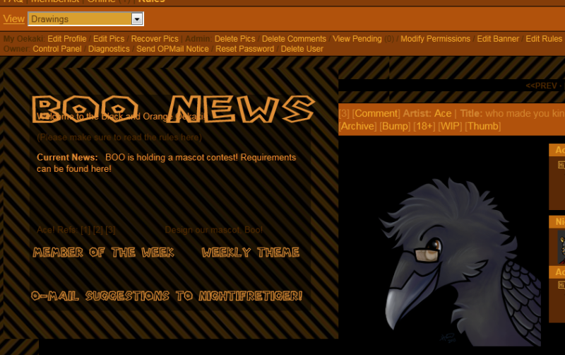
I'm having issues putting a table image at the top of my oekaki page. I want it to appear over the page numbers, but it always goes next to a picture. The screen looks like this: 
My table code is this:
Code:
<body>
<table width="500" height="404" "border="3" align="left" cellpadding="50" cellspacing="0" background="http://i2.photobucket.com/albums/y13/Gryphonlover/fronttablebg3.png">
<tr>
<td height="404"><p><div align=ceneter><font color="#e08e36">Welcome to the Black and Orange Oekaki!
</font></p>
<p>(Please make sure to read the rules here)</p>
<p><font color="#e08e36"><b>Current News:</b> BOO is holding a mascot contest! Requirements can be found here!</font></align></p>
<p> </p>
<p> </p>
<p>Ace! Refs: [1] [2] [3] Design our mascot, Boo!</p>
<p> </p>
<p> </p>
<p> </p>
</div>
</tr>
</table>
</body>Is there an error in the code that won't let it be centered on top?
Last edited by Tiger (06-20-2011 15:13:03)
Offline
#2 06-21-2011 03:45:00
- Trunksi
- Member

Re: Notice Above Page Numbers
align="left" seemed to cause it ![]()
tried it on my test board and it seems to work now after I removed it
and I removed some open div-tag and closed the td
oh and I removed the body-tags since I think they are unnecessary ![]()
Hope it will work now
Code:
<table width="500" height="404" border="3px" cellpadding="50" cellspacing="0" background="http://i2.photobucket.com/albums/y13/Gryphonlover/fronttablebg3.png">
<tr>
<td height="404"><p><font color="#e08e36">Welcome to the Black and Orange Oekaki!
</font></p>
<p>(Please make sure to read the rules here)</p>
<p><font color="#e08e36"><b>Current News:</b> BOO is holding a mascot contest! Requirements can be found here!</font></align></p>
<p> </p>
<p> </p>
<p>Ace! Refs: [1] [2] [3] Design our mascot, Boo!</p>
<p> </p>
<p> </p>
<p> </p>
</div>
</td> </tr></table>Offline
#3 06-21-2011 04:22:21
- Waccoon
- Administrator

Re: Notice Above Page Numbers
You've got a bunch of syntax and spelling errors in your code. Here, use this:
Code:
<table
width="500"
height="404"
border="0"
cellpadding="50"
cellspacing="0"
background="http://i2.photobucket.com/albums/y13/Gryphonlover/fronttablebg3.png"
style="margin: auto;"
>
<tr>
<td height="404">
<p style="color: #E08E36;">
Welcome to the Black and Orange Oekaki!
</p>
<p>
(Please make sure to read the rules here)
</p>
<p style="color: #E08E36">
<b>Current News:</b> BOO is holding a mascot contest! Requirements can be found here!
</p>
<p> </p>
<p> </p>
<p style="color: #E08E36">
<span style="float: left;">
Ace! Refs: [1] [2] [3]
</span>
<span style="float: right;">
Design our mascot, Boo!
</span>
</p>
</tr>
</table>There's a dozen ways to make this better, but you've have to split up your current fixed background. There's really no need to use a table for this when you can use a <div> instead.
Also, I used the "float" property for the Member of the Week and Weekly Theme so alignment will be more natural, and you can get rid of all those nasty non-breaking spaces.
Offline